 ZELDA Buy now
Art style and the model debate
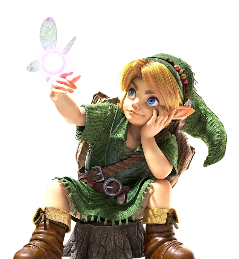
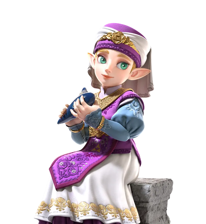
The official aim is stylized realism: modern materials with a storybook, almost puppet-like cast. Players split on whether the faces help that aim or fight it.
What the developers said
Ask the Developer and later interviews tie the character work to puppetry and practical-effects thinking. The goal they describe is a dreamlike charm, closer to the 1998 mood than to the painterly fields of Breath of the Wild. Colors are more muted and earthy on purpose.
What reviewers and players said
Polygon calls the environments astonishing and still thinks the disagreement is a real aesthetic split, not a broken renderer. TechRadar quotes players who say the models look smeared, with Link, Zelda, and Ruto named most often. A joke line, “run through DLSS 5,” shows up in that coverage. IGN has a separate piece on the puppetry reading of the same models.
I treat this as taste, not as a defect ticket. Digital Foundry’s frame-rate and resolution notes are on the performance page. A pretty forest and a debated face can both be true.
Questions
Why do the characters look different?
Nintendo aimed at stylized realism with a puppet-like cast. Some players read that as doll-like. Polygon says both sides have a point.
Did Zelda’s face change?
Young Zelda and Princess Zelda are part of the same debate. The character page collects the quotes.
Is the look a technical bug?
Polygon frames it as taste. Resolution and frame rate are measured separately by Digital Foundry.
Related
Sources
- Ask the Developer part 2 — checked 2026-11-05
- Polygon — checked 2026-11-05
- TechRadar — checked 2026-11-05
- IGN on puppetry — checked 2026-11-05